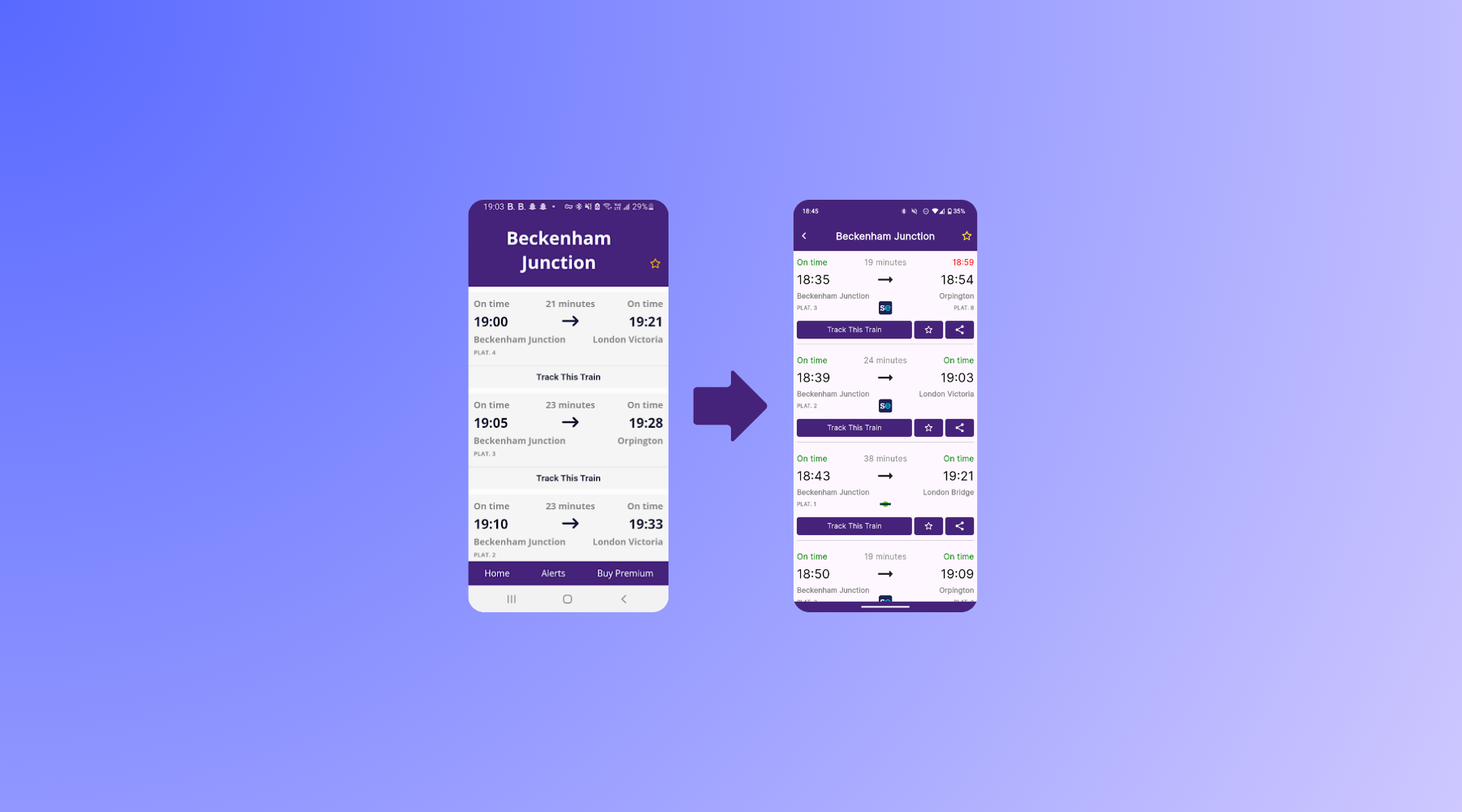
Welcome back to my multi-part series on how I built a fully capable and advanced train tracking app from scratch, what I learned along the way and the challenges I faced all while I was just 14 years old when I started. In this article, I will cover how I built the original Trainly app and the differences between then and now.
Series Contents
What was the first prototype version like?
After I'd spent a few weeks playing around with the Live Departure Board data and time interpolation, I figured it would be much more ideal to use this technology through an app rather than a primitive terminal app. I didn't know anything about mobile development at the time, however I stumbled across a library called AndroidJS. It basically lets you build Android apps using HTML, CSS, and JavaScript I was already familiar with. Perfect!
The first prototype was rough. Really rough. Think basic webpage squashed into a phone screen, wrapped up and launched like an app. It had no animations, very questionable design choices, and not even a loading spinner. But it worked. It let you see the trains from your chosen station (after a slow loading time), their live estimates, and track their rough progress using my interpolation method. That alone made it feel magical. I could open the app, click "Track This Train", and see something I built tell me where a train was. For the first time, I knew that I was onto something. But this also made me question, the lack of similar features in existing apps.
Of course, the limitations were obvious. It looked clunky, relied on hacky web-to-native communication, and didn't behave like a proper app, not to mention the fact that the APK alone was ~50MB despite it essentially just being a few text files. But as a first attempt, it gave me the motivation to keep going.
How did I rewrite the app?
I quickly realised that AndroidJS wasn't going to cut it long term. The support was minimal, the app was slow and the library wasn't actively being worked on. So, after a few weeks of battling JavaScript workarounds, I decided that I would rewrite the entire thing using proper Android tools—this time mixing HTML with Kotlin using the built-in WebView. This gave me more control and performance while still letting me use my existing front-end code. I could start introducing better layouts, smoother animations, and more dynamic interactions, and it actually felt like a real Android app.
What really stood out to me during this phase was how much more responsive the app felt. It still had the same backend logic—interpolating between station times (i.e. estimating where a train is between stops based on time)—but now it actually felt usable. This rewrite gave me the confidence to show it to friends and even use it daily on my commute, trusting it over well-established apps.
What about iOS?
Of course, I couldn't leave iPhone users behind—especially since most of the people I knew used iPhones. That made it the obvious next step. Once the Android version was working smoothly enough and published on the Play Store, I started working on an iOS version. However I hit a bit of a road block: to compile for iOS and to publish on the App Store, you require an account to be enrolled in the Apple Developer Program. This costs $99 a year (~£70) which isn't a small amount for something I didn't even know would be worth it. After a while though, I decided to take the plunge and spent my Christmas money on a subscription to the program.
At this point, I didn't want to write a completely separate frontend, so I used the same idea: embed a web interface using Swift's WebView and link it up to native features where needed. Getting it to compile on Xcode was half the battle—Apple's ecosystem felt alien at first—but once it was running, the process was surprisingly similar to the Android WebView version. The hardest part was dealing with iOS-specific permissions and quirks, but eventually I had a working iPhone build that behaved mostly the same as the Android one.
I even managed to deploy a test version using TestFlight, which made sharing the app with friends on iPhones super easy. Although the iOS version didn't feel quite as smooth as the Android one, it was good enough to be useful. More importantly, I'd officially crossed into the world of cross-platform development. I also released this version on the App Store, which was a huge milestone for me.
Why did I rewrite it again?
Everything changed when I discovered Flutter. Suddenly, I could build for Android and iOS at the same time—with proper native performance, beautiful UIs, and no hacky WebViews. I rewrote the entire app from scratch once more, making a few design tweaks, and this time it finally felt like the polished, proper experience I'd always wanted Trainly to be.
The new design (as it is today) introduced more visual feedback, better train tracking, live delay indicators, and more accessible UI elements. I even added little features like operator indications, favourites, and a proper share button. It was miles ahead of the original prototype, and now something I was genuinely proud to share.
Flutter also allowed me to improve how the app handled updates. Since it's all one codebase, adding new features or fixing bugs didn't require twice the effort. And with more experience under my belt, I could focus on making the app faster, more stable, and more delightful to use.
Thanks for reading, and I hope you have an amazing day!


